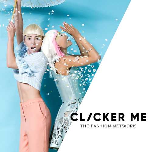


Fashion network | 2018
Project length: 4 months
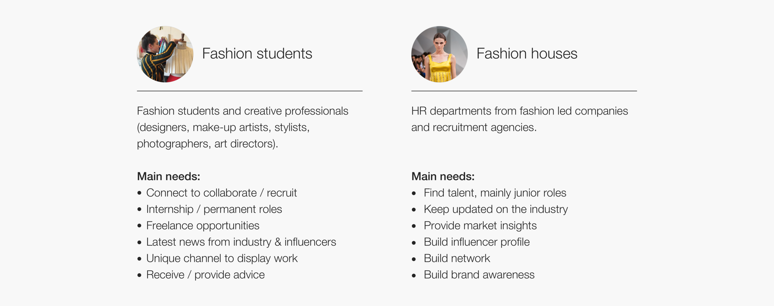
I’ve on-boarded this startup project to help shape a brand new service aiming to connect graduates and junior professionals with the dazzling fashion industry in the UK. Working directly with the CEO, we gathered early insights from the target audiences they were aiming to focus on: students, recruiters and fashion houses.
The board team, formed by C-level professionals involved in the educational, tech and fashion sectors was keen to move fast by prototyping and testing the concept with potential users and opted not to continue with further research in the early stages.
1- Shared vision of business opportunities and goals.
2- Competitor Analysis: analogous experiences available in the market, such as Linkedin, the Dots, Business of Fashion.
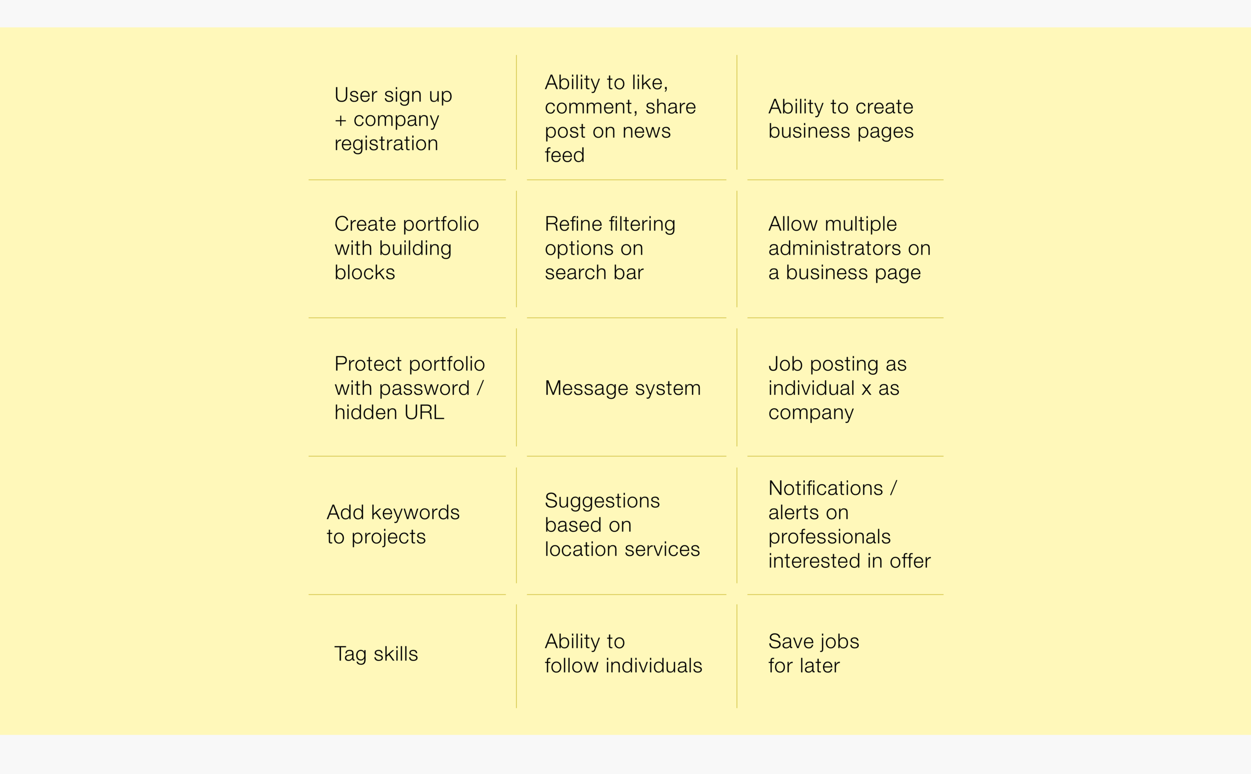
3- Prioritisation of most important features delivering the brand promise and addressing user needs with high impact.
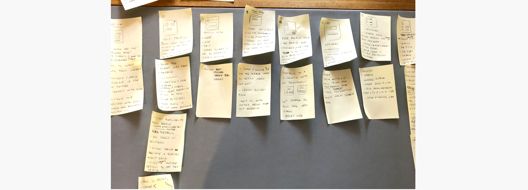
A design workshop helped the team visualise user touch points and define the site navigation, with key sections and functionalities planned to be included on main screens.
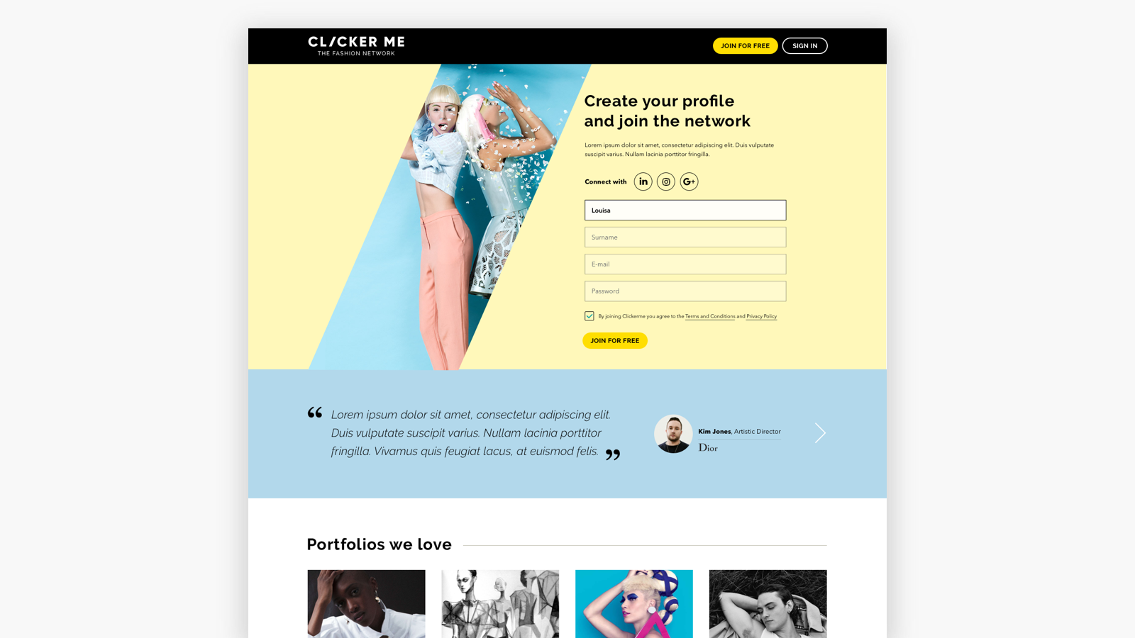
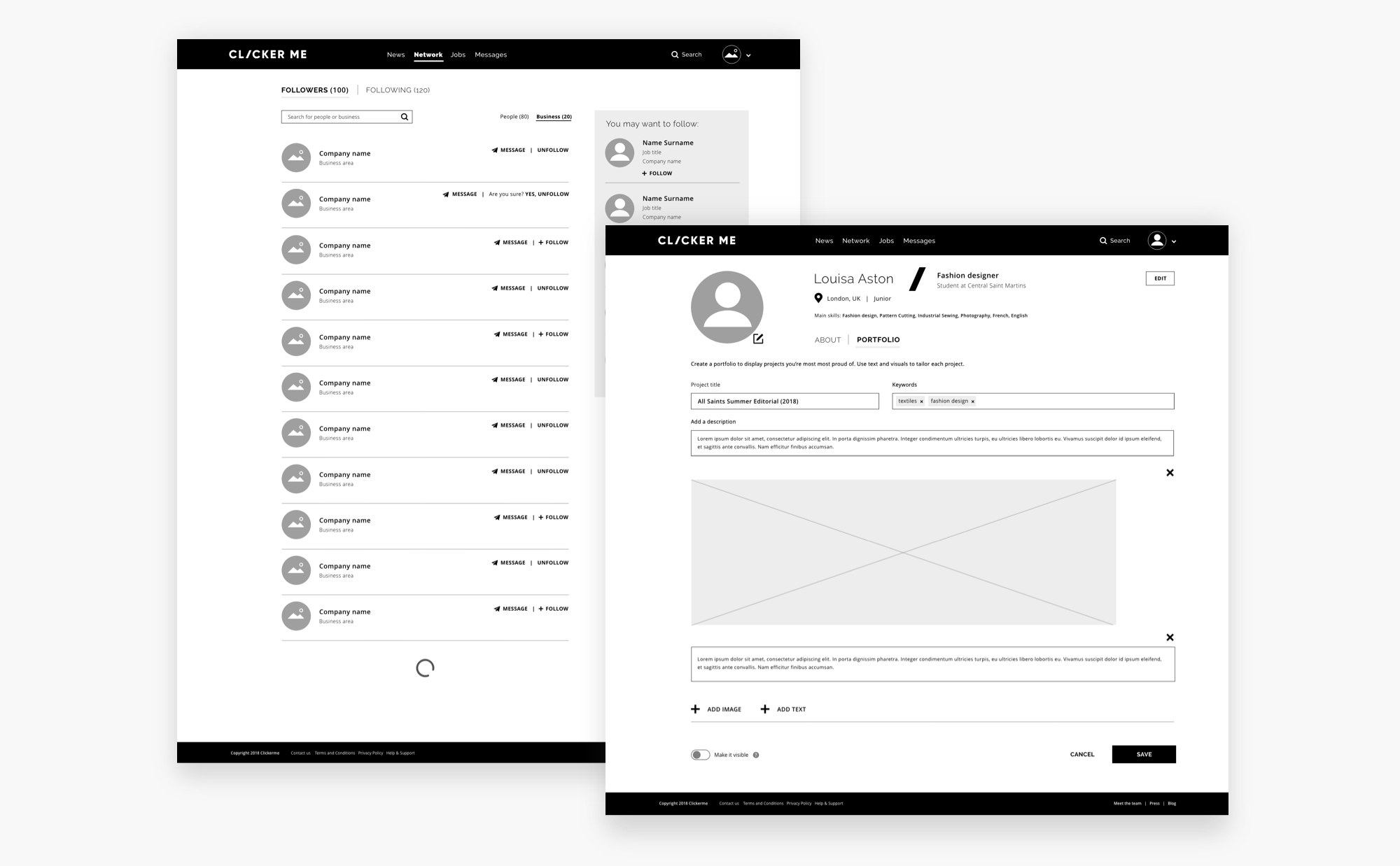
Aiming to provide a vision of the product and test the desirability with potential users, a prototype was built using detailed wireframes. The complete flow, consisting of around 70 individual screens, was designed and iterated with the team and helped us gather valuable user insights.
A test guide was defined and used on 1-1 sessions with fashion students and professionals alike.
The platform goal was to onboard members first, aid professionals needing a space to display their work and get informed about the industry. Therefore, sections such as “Jobs”, not part of the MVP scope, were only presented to users for insights on their needs and interests.
The proof of concept was well accepted on the first round of testing and user feedback helped us iterate and improve the experience. The insights were then merged into themes and a set of actions / updates recommended.
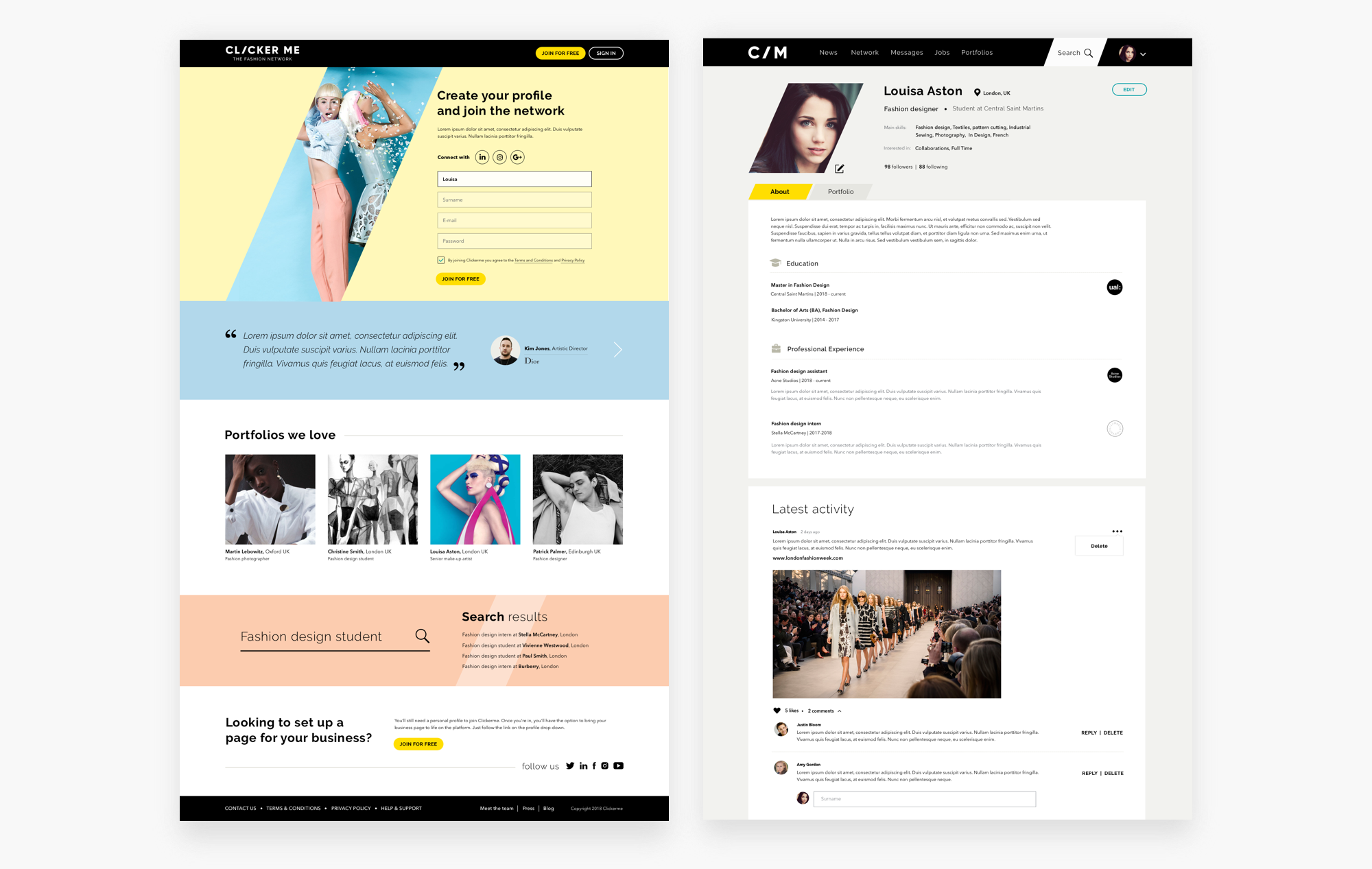
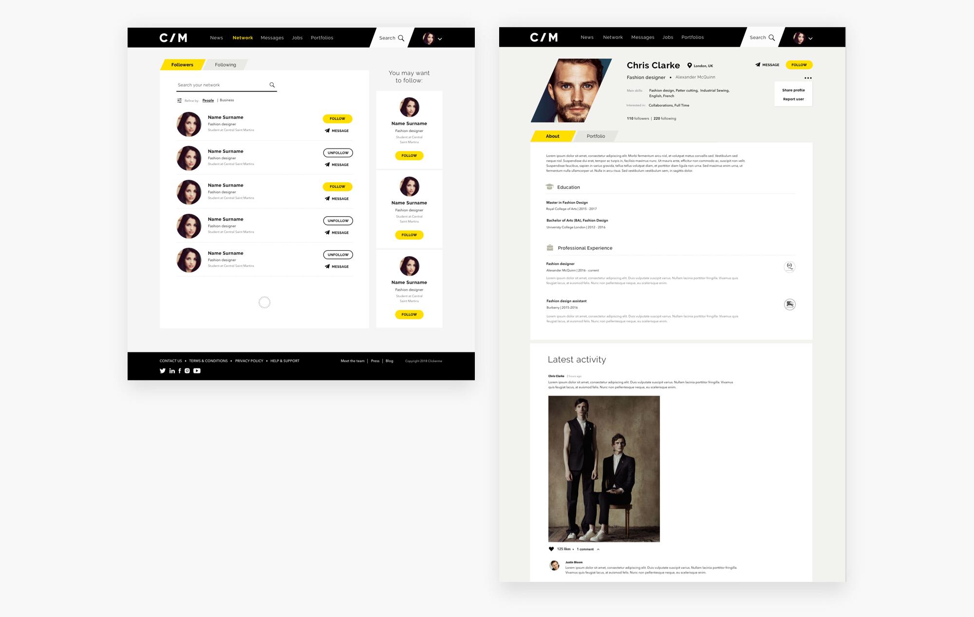
The next part of my scope of work was to provide a visual direction to the platform, including a UI library and polished design for the top level screens based on the brand guidelines already in place.
The brand tone of voice was defined as relaxed, informed and driven. The sharp edges and shapes combined with subtle pastel tones were meant to provide a balance between sleek (fashion) and friendly (social network).
The brand is predominately monotone, so the accent palette is in place to divide content and highlight actions or communicate alerts. User generated content is meant to bring the platform canvas to life throughout the journey.
This collaboration came to an end and the internal team took over the task of developing and iterating the product.
Check the beta version available at clickerme.com